Superlopez is and always has been my favorite comic book character. Undoubtedly because Jan is my favorite cartoonist of all time.
During the 1980s, every Superlopez album was a masterpiece, and possibly the most creative output ever seen in the world of Spanish comics. I would say that on an international level, too, it was on a par with Goscinny’s scripts and the drawing style of the Franco-Belgian school.
However, the spread of Superlopez outside Spain has always been limited, perhaps due to licensing issues with Superman or the short-sightedness and mediocrity of Iberian businessmen. Within Spain, it was relegated to being just another cog in the production chain of the publishing house in charge, which never saw the real potential of the work.
As the 1990s passed and we entered the 2000s, Superlopez lost the hallmarks that I liked so much: the parody, the rounded four-headed drawing style, and the multitude of details in each panel.
Despite the change of direction in the scripts, I have never been able to understand why he has been relegated to second place behind Ibañez in the history of Spanish comics, given that Jan is infinitely superior. Superior in terms of drawing, since Jan truly created his own style that was much more complex and intelligent than that of Ibañez (who copied and adapted Franquin) and with scripts extraordinarily loaded with meaning that were unlike anything else done in the medium either before or today, while the rest of the authors repeated the same joke over and over again.
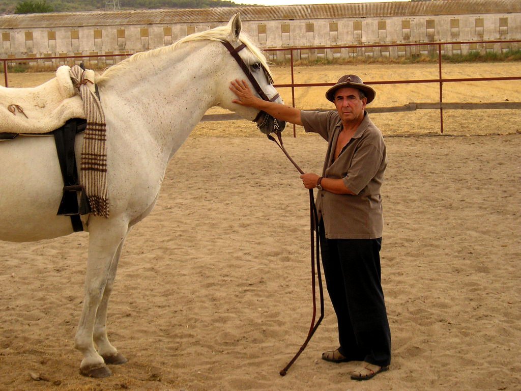
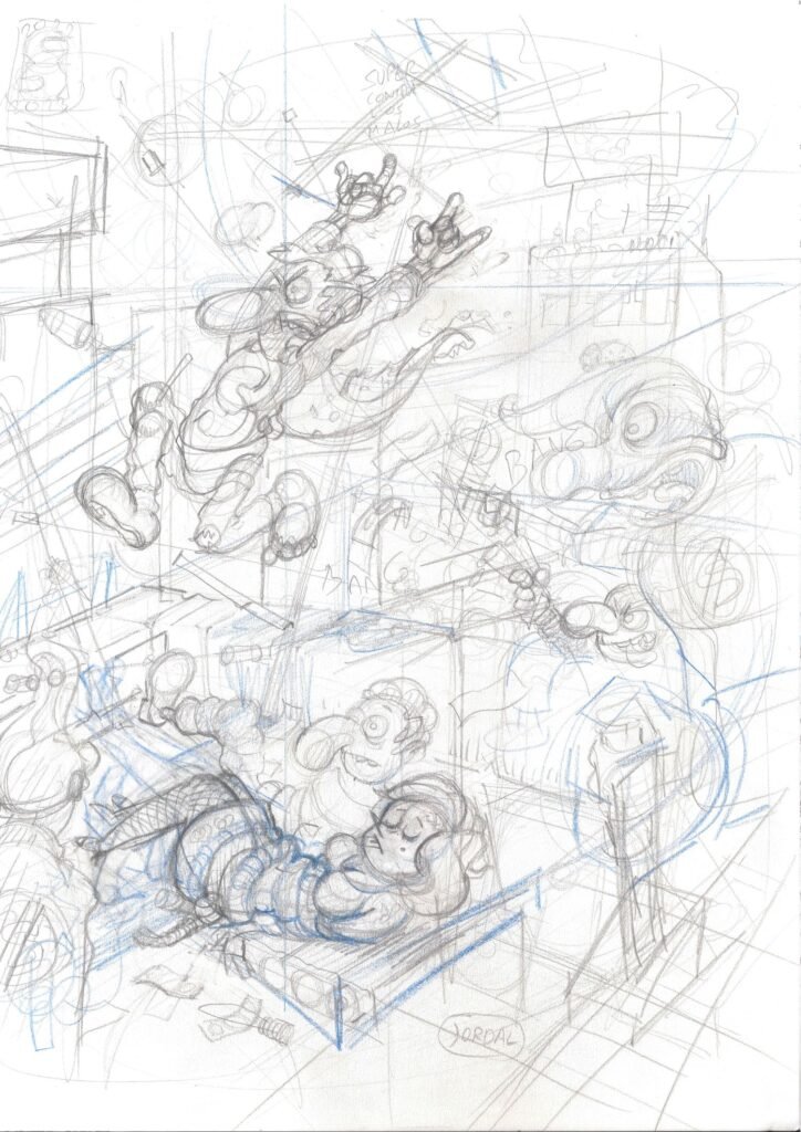
Although Jan doesn’t want anyone to imitate his style, I can’t imagine Super Lopez without his original design, so I drew this fan art. May the master forgive me.

My own list of favorites and some of the reasons why.
I find it impossible to decide on an order because they are all so different from each other and I don’t think they can be ranked:
“La Semana más larga” (The Longest Week), the most representative portrait of the boredom of the average citizen. The life of the Spanish wage earner, identity issues, and fantasy mixed with a detective story. The world of soccer faithfully portrayed, which continues to move masses today. Infinite details in each panel. Unforgettable peanut jokes, which is the shape of Inspector Holmez’s nose.
“Cachabolik Blues Rock,” although not a classic, I still find it hilarious, original, and totally unexpected. It marks an increasingly realistic drawing style. The supporting characters become protagonists, but the parody remains. The discourse about the artist who does something commercial instead of what he would like to do is interesting, a message that is both transparent and disconcerting coming from an artist of Jan’s stature in a comic “for children.”
“La Gran Superproducción” (The Big Blockbuster) is the best portrayal of the world of cinema to date. It faithfully reflects the climbing, stardom, and other neuroses, including “crunch time.” It is a comic book version of “La Noche Americana” (American Night).
“El Supergrupo,” superheroes asking for a loan at a bank, is unbeatable. Along with “Las Aventuras de Superlopez,” it’s the best parody of the genre to date. Brilliant. It’s hard to tell what’s Jan’s and what’s Efepe’s.
“Los cabecicubos” (The Head Cubes) is totally disconcerting. It draws parallels with the civil war and all wars. It’s interesting how the secondary characters are integrated into the main story.
“Los alienígenas” (The Aliens) features unforgettable news pages in this comic, reflecting the power of the written press long before the advent of the internet. The theme of identity and the double is explored in depth. It’s a parody of the army and power.
“El señor de los chupetes” (The Lord of the Pacifiers), fantastic adventures without straying from social criticism with irony. A very parodic Superlopez who oscillates between “I must save the world” and “Leave me alone.” This characteristic was lost over time and is one of the hallmarks that gave the character his personality.
“Los petisos carambanales” (The Shorties), possibly the most creative of all, although not the funniest, and the best drawn along with “Al Centro de la Tierra” (To the Center of the Earth). There is something of Peyo in these shorties, possibly. Jan took the trouble to create an alphabet that some even learned by heart.
Although “Pandora’s Box” is not among my favorites, it is a must-read. It marks the beginning of a more realistic style of drawing. It is supposed to be the one that starts a more adult stage, but I consider that “Los cabecicubos” or “El señor de los chupetes” already had multiple interpretations. It can be linked to “Laszivia,” a rarity that Jan drew in his best period, with another character and theme, but retaining the sense of humor and graphics that characterized his best period.
Other titles are also interesting, as is the evolution of Jan’s drawing over the following decades, but for me, this period in the 1980s is unbeatable.
Thank you, maestro ❤️ .